In This Python Matplotlib tutorial, we are about to see how to plot Bar charts in Matplotlib with Python and also we will explore some customization of the MtplotLib bar chart. Matplotlib Bar Charts are one of the efficient ways to compare categorical values.
Before starting using the Python Matplotlib Librray, Make sure you have installed the Python Matplotlib library in your Python environment.
To install Matplotlib, You can use the below command.
pip install matplotlibLet’s start.
Headings of Contents
What is a Bar Chart in Python Matplotlib?
A bar chart in Python Matplotlib is a graphical representation of the categorical data. It is a way of comparing categorical data with their values. Where the bars of width plotted along the x-axis indicate the different categories and height of the each bar indicates its corresponding value.
As you can see, the Below picture is the best example of a Bar chart that compares the market share of multiple products.

These are some key features of the Matplotlib Bar chart.
- Categories:- These are the distinct groups or classes that will be compared with each other.
- Bars:- Bars are rectangles drawn vertically or horizontally to represent the value of the corresponding category.
- Axis:- In Bar Char, Typically category represents the X-Axis and Value represents the Y-Axis.
Let’s move on to the topics.
Plot Bar Charts in Matplotlib with Python
Here we will plot multiple bar charts with different-different of customizations.
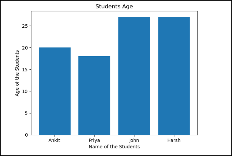
Let’s create a simple Matplolib bar chart without any customizations where the category will be the name of some students and the value represents the age of the students.
import matplotlib.pyplot as plt

# list of student's name
name = ['Ankit', 'Priya', 'John', 'Harsh']

# list of studdent's age
age = [20, 18, 27, 27]

# Plotting the bar chart
plt.bar(name, age)
plt.xlabel('Name of the Students')
plt.ylabel('Age of the Students')
plt.title('Students Age')
plt.show()
In this example:
- We define two lists: name containing the names of students and age containing their corresponding age figures.
- We use
plt.bar()to create the bar chart, passing the name and age figures as arguments. - We add labels to the x-axis and y-axis using
plt.xlabel()andplt.ylabel()respectively. - We set the title of the chart using
plt.title(). - Finally, we display the chart using
plt.show().
Output
Let’s add some Bar chart customizations to make it more readable and attractive.
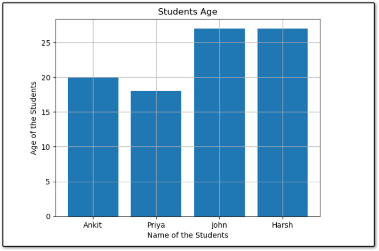
Adding Grid Lines to Bar Chart
To add grid lines in the Matplotlib bar chart, I have applied the plt.grid() method.
import matplotlib.pyplot as plt

# list of student's name
name = ['Ankit', 'Priya', 'John', 'Harsh']

# list of studdent's age
age = [20, 18, 27, 27]

# Plotting the bar chart
plt.bar(name, age)
plt.xlabel('Name of the Students')
plt.ylabel('Age of the Students')
plt.title('Students Age')

# Adding grid lines
plt.grid()

plt.show()
After adding the grid lines in a bar chart, The bar chart will look like this.
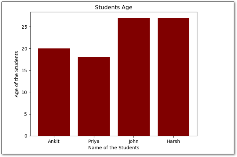
Changing the color of the Bars
To change the color of the bars in the Bar chart, use the color parameter of the bar() method for example, if I want to change the color of the bar to maroon then I will pass maroon in the color parameter.
import matplotlib.pyplot as plt

# list of student's name
name = ['Ankit', 'Priya', 'John', 'Harsh']

# list of studdent's age
age = [20, 18, 27, 27]

# Plotting the bar chart
plt.bar(name, age, color = 'maroon')
plt.xlabel('Name of the Students')
plt.ylabel('Age of the Students')
plt.title('Students Age')


plt.show()
After changing the color of the bar, the Bar chart will be this:
This is how we can change the color of the bars but sometimes we want to change the color of each bar then we can pass the list of the color names to the color parameter.
Note:- The length of the color's name will be the same as the length of the categories and values.
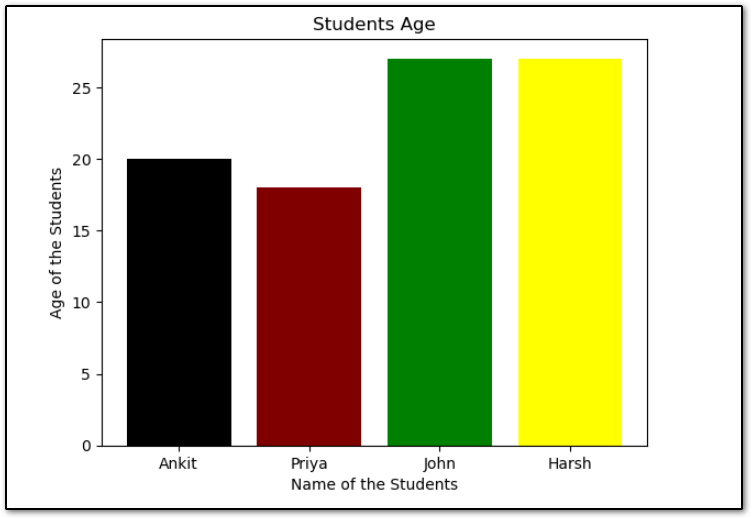
Let’s see how we can change the color of each bar in the Matplotlib bar chart. I have passed the four color names in the list because I have a category with four names.
import matplotlib.pyplot as plt

# list of student's name
name = ['Ankit', 'Priya', 'John', 'Harsh']

# list of studdent's age
age = [20, 18, 27, 27]

# Plotting the bar chart
plt.bar(name, age, color=['black', 'maroon', 'green', 'yellow'])
plt.xlabel('Name of the Students')
plt.ylabel('Age of the Students')
plt.title('Students Age')

plt.show()
After changing the color of each bar, the new bar chart will look like this.
Adding Label to the Bar Chart’s Bars:
In Matplotlib’s bar method, the label parameter is used to assign a label to the bar chart’s bars. This label is then used when creating a legend for the plot, allowing you to identify the different elements of the chart.
It can take a single or a list of values. If you pass a single value then that value will be the same as all the bars and if you pass a list of values then each value will be assigned to the corresponding category.
Note:- Remember, When you are using a list of labels the length of it must be the same as the length of categories.
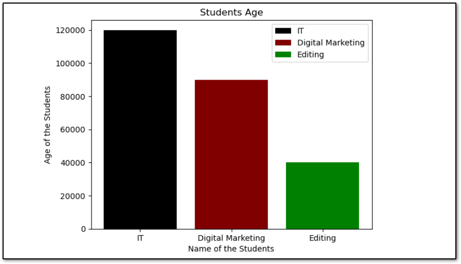
Here, I have passed the department_name to the label parameter of the bar() method because I wanted to assign the label of each bar with their name.
import matplotlib.pyplot as plt

# list of student's name
department_name = ['IT', 'Digital Marketing', 'Editing']

# list of studdent's age
age = [120000, 90000, 40000]

# Plotting the bar chart
plt.bar(department_name, age, color=['black', 'maroon', 'green'], label=department_name)
plt.xlabel('Name of the Students')
plt.ylabel('Age of the Students')
plt.title('Students Age')
plt.legend()
plt.show()
After adding the labels and applying the legend(), The Bar chart will look like this:
You can change the position of the legend by using the loc parameter of the legend() method. For example, to show the legend on the left side in lower, You can use the ‘lower left‘ value in the loc parameter.
plt.legend(loc='lower left')There are various parameters available in the legend() method that you can use to customize the legend.
Display the Value of Each Bar in Bar Char
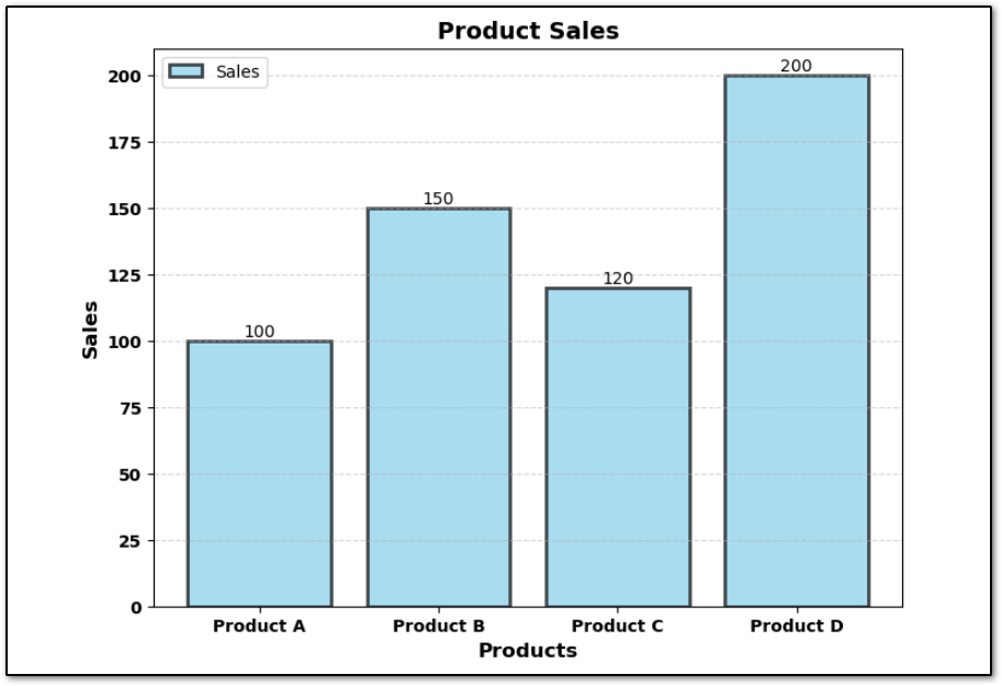
To display the value of each bar in the Matplolib Bar chart, we will use plt.text() method which is used to add text annotations to specified coordinates.
import matplotlib.pyplot as plt

# Sample data
products = ['Product A', 'Product B', 'Product C', 'Product D']
sales = [100, 150, 120, 200]

# Increase the figure size for better readability
plt.figure(figsize=(8, 6))

# Plotting the bar chart with additional customizations
bars = plt.bar(products, sales, color='skyblue', edgecolor='black', linewidth=2, alpha=0.7)

# Adding data labels
for bar in bars:
    yval = bar.get_height()
    plt.text(bar.get_x() + bar.get_width()/2, yval, round(yval, 2), va='bottom', ha='center', fontsize=10)

plt.xlabel('Products', fontsize=12, fontweight='bold')
plt.ylabel('Sales', fontsize=12, fontweight='bold')
plt.title('Product Sales', fontsize=14, fontweight='bold')
plt.xticks(fontsize=10, fontweight='bold')
plt.yticks(fontsize=10, fontweight='bold')

# Add horizontal grid lines
plt.grid(axis='y', linestyle='--', alpha=0.5)

# Adding a legend
plt.legend(['Sales'], loc='upper left', fontsize=10)

plt.show()
In the above example:
- We increased the figure size using plt.figure(figsize=(8, 6)) to improve readability and presentation.
- Data labels are now placed at the top of each bar using plt.text() with adjusted font size and alignment.
- Axes labels and titles are customized with specific font sizes and weights.
- Tick labels on both axes are also customized with bold font and increased font size.
- Horizontal grid lines are added using plt.grid() to provide better visual guidance.
- A legend is placed in the upper right corner using plt.legend(), specifying the legend label and its font size.
After adding the value to each bar in the Bar chart, The bar chart will look like this:
Plot Horizontal Bar Chart in Matplotlib
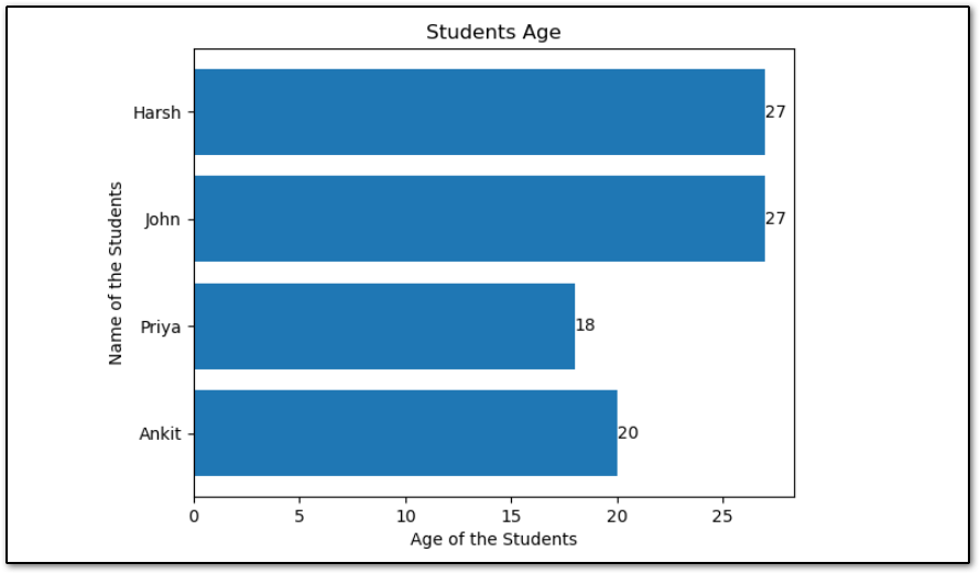
To plot a horizontal bar chart in Matlotlib, Matplotlib provides a method barh() that is used to create a Horizontal Bar chart. Let’s create a simple Horizontal bar chart and also we will add the value of each bar in the bar chart with the help of plt.text().
import matplotlib.pyplot as plt

# list of student's name
name = ['Ankit', 'Priya', 'John', 'Harsh']

# list of studdent's age
age = [20, 18, 27, 27]

# Plotting the bar chart
x = plt.barh(name, age, height=0.8)

for bar in x:
    print(bar)
    yval = bar.get_width()
    plt.text(yval, bar.get_y() + bar.get_height()/2, yval, va='center')

plt.xlabel('Age of the Students')
plt.ylabel('Name of the Students')
plt.title('Students Age')
# plt.grid()

plt.show()
Now, the Horizontal Bar Chart will look like this.
Python Matplotlib Useful Functions
- Python Matplotlib Tutorial 2024
- How to Create Line Plot with Matplotlib in Python
- How to Make Scatter Plots with Matplotlib with Examples
Conclusion
A bar chart is one of the best ways to visualize categorical data. Throughout this article, we have seen How to plot bar charts in Matplotlib with Python with the help of multiple examples and also explored some customizations.
If you have multiple categories and their values and you want to compare all those categories’ values then bar charts are the most powerful tool to visualize the categorical data.
Matplotlib bar chart provides a variety range of customizations and this is not possible to cover all customization options in a single article.
If you want to enhance the bar charts then you must try different different customizations of the bar chart.
Click the below links to visit the official docs of bar(), barh(), and text() methods and explore them.
If you found this article helpful, please share and keep visiting for Matplotlib articles.