In this Python Matplotlib tutorial, we will see how to make Scatter Plots with Matplotlib with the help of multiple examples. Python matplotlib library provides a function called scatter() that is used to plot the scatter plot.
As we know Data Visualization plays a major role in the Data analysis domain because it allows us to major trends so of the data. There are various kinds of data visualization charts available in the Python Matplotlib library but in this article, we will only focus on scatter plots.
Before going too deep into this article let’s see a little about the Python Matplotlib library.
Headings of Contents
What is MatplotLib in Python?
MatplotLib is one of the popular and open-source libraries for data visualization tools written in Python Programming Language. It provides various types of charts and the charts could be static and interactive.
It is an external library which means you need to install it in your Python environment with the help of the Python package manager called pip.
Use the below command to install MatplotLib in your Python environment.
pip install matplotlibOnce installed, import Matplotlib into your Python script or Jupyter Notebook using the following import statement.
import matplotlib.pyplot as pltHere, I am using a Jupyter Notebook to demonstrate this article.
What is a Scatter Plot in MatplotLib?
A scatter plot in Matplotlib is a kind of data visualization chart that displays the relationship between two variables by representing individual data points on a two-dimensional plane.
Each data point in a scatter plot is represented by a marker, such as a dot or a symbol, with its position determined by the values of the two variables being compared.
Getting Started – Make Scatter Plots with Matplotlib
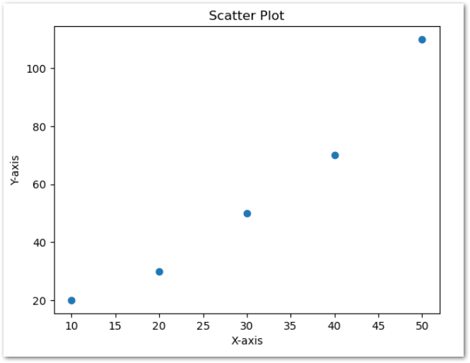
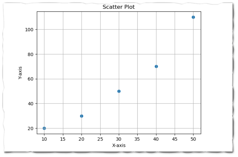
Now Let’s create a sample scatter plot with the help of the scatter() function.
import matplotlib.pyplot as plt

# Sample data to plot scatter plot
x = [10, 20, 30, 40, 50]
y = [20, 30, 50, 70, 110]

# Create a scatter plot
plt.scatter(x, y)

# Add labels and title
plt.xlabel('X-axis')
plt.ylabel('Y-axis')
plt.title('Scatter Plot')

# Display the plot
plt.show()
In the above example:
- I have imported the pyplot module as plt from the Python Matplotlib library.
- Created two Python datasets called x and y.
- Passed the x and y to the plt scatter() function.
- Used xlabel() function to add a label for the X axis and used ylabel() to add a label for the Y axis and also used title() function to title this scatter plot.
- Finally displayed the scatter plot using the show() function.
After executing the above code, The Output will be:
Parameters of the scatter() function
The scatter() function accepts various parameters with different-different use cases.Let see some useful parameters of the scatter() functions.
- x, y:- x and y both are primary parameters in the scatter() function where x indicates the data points for the x-axis and y indicates the data points for the y-axis.
- s:- This parameter is responsible for setting the size of the markers in the scatter plot. This parameter will be optional.
- c:- This parameter sets the color of the markers in the scatter plot. This parameter will be optional.
- marker:- This parameter sets the marker style for the data points in the scatter plot. default value of this parameter is ‘o’. This parameter will be optional.
- cmap:- This cmap parameter is used to set the colormap for the scatter plot when the ‘c’ parameter is used to specify the color for the scatter plot. This parameter will be optional.
- alpha:- This parameter is used to set the transparency of the markers in the scatter plot. This parameter will be optional.
- label:- This parameter is used to set the label for the scatter plot. This parameter will be optional.
- cbar: This parameter specifies whether to display a color bar alongside the scatter plot when the c parameter is used.
- It can be a boolean value (True or False).
- The default value of this parameter is False.
Let’s customize the scatter plot with different parameters of the scatter plot.
Adding Grid to Scatter Plot
To add grid lines to the scatter plot, Matplotlib provides a function called plt.grid().grid in the scatter plot makes it more readable.
Let’s see the grid lines to the scatter plot with the help of the plt.grid() function.
import matplotlib.pyplot as plt

# Sample data to plot scatter plot
x = [10, 20, 30, 40, 50]
y = [20, 30, 50, 70, 110]

# Create a scatter plot
plt.scatter(x, y)

# Add labels and title
plt.xlabel('X-axis')
plt.ylabel('Y-axis')
plt.title('Scatter Plot')

# adding grid
plt.grid()

# Display the plot
plt.show()
As you can see we have added plt.grid() to add grid lines to the scatter plot. After executing the above code the output will be:
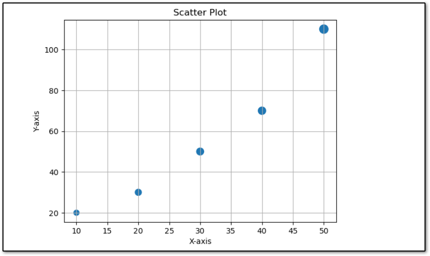
Changing the size of the marker
Matplotlib scatter() function takes a parameter called ‘s‘ which is used to set the size of the marker. It can take single or array-like values.
For example, I want to change the size of each marker with different different values.
import matplotlib.pyplot as plt

# Sample data to plot scatter plot
x = [10, 20, 30, 40, 50]
y = [20, 30, 50, 70, 110]
size = [50, 70, 90, 100, 130]

# Create a scatter plot
plt.scatter(x, y, s=size)

# Add labels and title
plt.xlabel('X-axis')
plt.ylabel('Y-axis')
plt.title('Scatter Plot')

# adding grid
plt.grid()

# Display the plot
plt.show()
As you can see in the above code, I have created a Python list with the size of each marker and passed that list to the s parameter of the scatter() function.
The output of the above code will be:
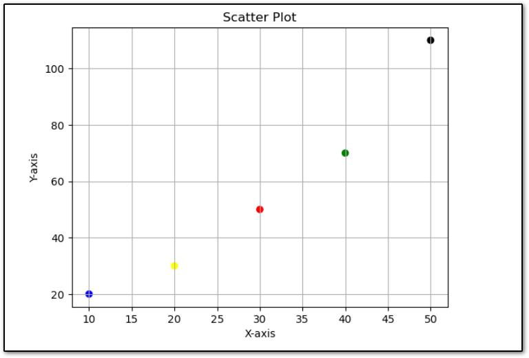
Changing the color of the Marker
To change the color of the marker you can use the ‘c’ parameter of the scatter() function. The ‘c’ parameter of the scatter() function takes a single or array of the values which indicates the color names like blue, yellow, etc.
Let’s change the color of the marker in a scatter plot. Here, I am about the change the color of each marker.
import matplotlib.pyplot as plt

# Sample data to plot scatter plot
x = [10, 20, 30, 40, 50]
y = [20, 30, 50, 70, 110]
color = ['blue', 'yellow', 'red', 'green', 'black']

# Create a scatter plot
plt.scatter(x, y, c=color)

# Add labels and title
plt.xlabel('X-axis')
plt.ylabel('Y-axis')
plt.title('Scatter Plot')

# adding grid
plt.grid()

# Display the plot
plt.show()
The output code will be:
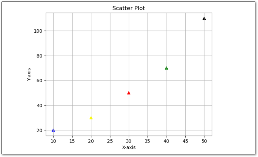
Changing the shape of the marker
In all the above examples we have seen a scatter plot with ‘o’ marker because ‘o’ is the default marker of the scatter plot but we can also change the marker of the scatter plot.
Here I am about to change the marker with the help of the marker of the scatter plot.
marker parameter accepts a variety of symbols that represent the different markers.
Let’s change the marker from ‘o’ to ‘^’ which will indicate the triangle as a marker.
import matplotlib.pyplot as plt

# Sample data to plot scatter plot
x = [10, 20, 30, 40, 50]
y = [20, 30, 50, 70, 110]
color = ['blue', 'yellow', 'red', 'green', 'black']

# Create a scatter plot
plt.scatter(x, y, c=color, marker='^')

# Add labels and title
plt.xlabel('X-axis')
plt.ylabel('Y-axis')
plt.title('Scatter Plot')

# adding grid
plt.grid()

# Display the plot
plt.show()
As you can see in the above code, I have changed the marker ‘o’ to ‘^’.When you execute the above code the output will be:
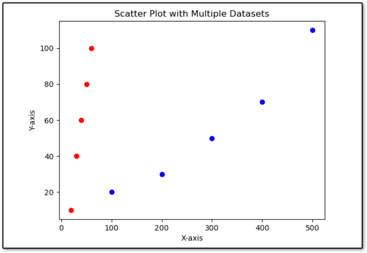
Plot Multiple Datasets on Scatter Plot
To plot multiple datasets on a scatter plot using Python Matplotlib, you can simply call the scatter() function multiple times with different datasets. Each call to scatter() will add a new set of data points to the plot.
Here’s a step-by-step guide on how to do it
import matplotlib.pyplot as plt

# Sample data for multiple datasets
x1 = [100, 200, 300, 400, 500]
y1 = [20, 30, 50, 70, 110]

x2 = [20, 30, 40, 50, 60]
y2 = [10, 40, 60, 80, 100]

# Plot the first dataset
plt.scatter(x1, y1, label='Dataset 1', color='blue')

# Plot the second dataset
plt.scatter(x2, y2, label='Dataset 2', color='red')

# Add labels and title
plt.xlabel('X-axis')
plt.ylabel('Y-axis')
plt.title('Scatter Plot with Multiple Datasets')

# Display the plot
plt.show()
In this example:
- We have two sets of sample data, x1, y1 and x2, y2, representing two different datasets.
- We call the scatter() function twice, once for each dataset. Each call specifies the x-coordinates (x1 or x2) and y-coordinates (y1 or y2) for the data points, as well as customizations such as marker color and label.
- We add labels to the x and y axes and a title to the plot using the xlabel(), ylabel(), and title() functions, respectively.
After adding multiple datasets into scatter plot, The scatter plot will look like this.
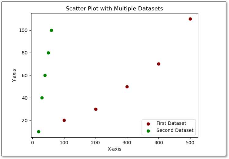
Adding legend to Scatter Plot
To add a legend in a scatter plot, Matplotlib provides a function called legend(). The legend() function adds the legend based on the datasets used in the scatter plot.
Let’s add the legend in the above scatter plot.
import matplotlib.pyplot as plt

# Sample data for multiple datasets
x1 = [100, 200, 300, 400, 500]
y1 = [20, 30, 50, 70, 110]

x2 = [20, 30, 40, 50, 60]
y2 = [10, 40, 60, 80, 100]

# Plot the first dataset
plt.scatter(x1, y1, label='First Dataset', color='maroon')

# Plot the second dataset
plt.scatter(x2, y2, label='Second Dataset', color='green')

# Add labels and title
plt.xlabel('X-axis')
plt.ylabel('Y-axis')
plt.title('Scatter Plot with Multiple Datasets')

plt.legend()

# Display the plot
plt.show()
As you can see on the above dataset how I have added the legend with the help of the legend() function.
The output will be:
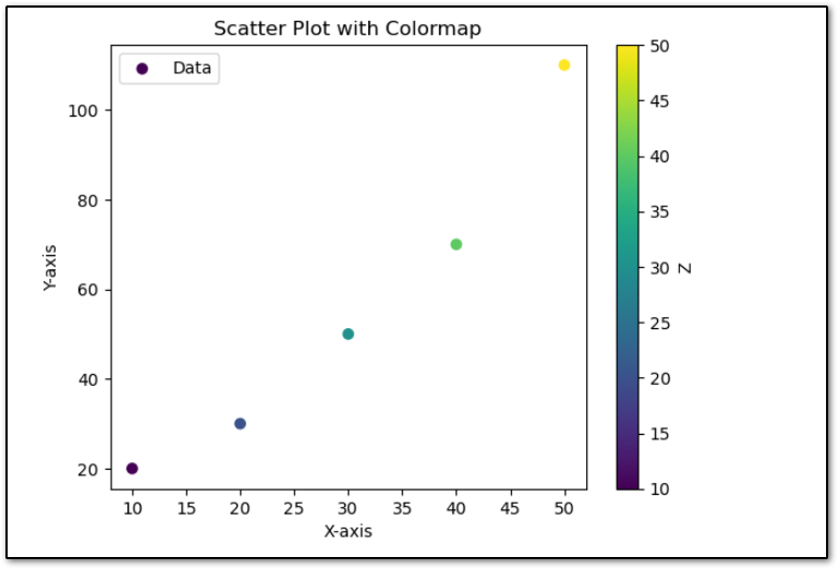
Adding colormap to the scatter plot
Matplotlib provides a function called colormap() that allows us to map the third dimension of the data to the color of the scatter plot.
Matplotlib provides a range of colormaps that can help visually represent the additional information of the scatter plot. Here you can see, How to use colormaps to the Matplotlib scatter plot.
import matplotlib.pyplot as plt

# Sample data
x = [10, 20, 30, 40, 50]
y = [20, 30, 50, 70, 110]
z = [10, 20, 30, 40, 50]  # Third dimension data

# Plot the scatter plot with a colormap
plt.scatter(x, y, c=z, cmap='viridis', label='Data')

# Add colorbar to show colormap scale
plt.colorbar(label='Z')

# Add labels and title
plt.xlabel('X-axis')
plt.ylabel('Y-axis')
plt.title('Scatter Plot with Colormap')

# Add legend
plt.legend()

# Display the plot
plt.show()
In the above example.
- We have three sets of the sample data ‘x‘, ‘y‘, and ‘z‘ where ‘z‘ indicates the third dimension of the data that we want to map to the color of the markers.
- We use the scatter function and pass ‘z‘ to the ‘c‘ parameter and also we specify the colormaps with the help of the cmap parameter. In this case, we use ‘viridis‘ color map.
- And finally, we add the color bar with the help of the colorbar() function to show the scale of the colormap.
- Finally, we add the xlabel, ylabel, and title with the help of the xlabel(), ylabel() and title() function.
After executing the above code the output will be:
👉 Plot Line Chart in Matplolib:- Click Here
Summary
Creating scatter plots with Matplotlib in Python is a straightforward process that can yield valuable insights into relationships between variables in your datasets. By mastering scatter plots with Matplotlib, you can effectively visualize correlations, patterns, and outliers in your data, enabling you to make informed decisions based on data analysis. In this article, we’ve covered the basics of creating scatter plots with Matplotlib.
If you found this article helpful, please share and keep visiting for further Matplotlib tutorials.
Happy plotting!