Hi, In this Python MatplotLib tutorial, we are about to see How to Create Line Plot with Matplotlib in Python with the help of the multiple ways and infect we will see how we can customize the line chart with the different parameters.
As we know, Data visualization is a crucial aspect from a data analysis point of view, allowing us to gain insights and communicate findings effectively. Among the various types of visualizations, line plots are particularly useful for depicting trends and relationships in data over time or across different variables. In this article, we’ll explore how to create line plots using Matplotlib, a powerful plotting library in Python. Whether you’re a data scientist, researcher, or developer, mastering line plots with Matplotlib can elevate your data visualization skills to new heights.
Headings of Contents
What is Matplotlib?
Before we delve into creating line plots, let’s get familiar with Matplotlib. Matplotlib is a widely used plotting library in Python that offers a flexible platform for creating a variety of static, interactive, and publication-quality plots. It provides a comprehensive set of tools for visualizing data, making it a go-to choice for data visualization tasks in Python.
What is a Line Chart in Matplotlib?
A line chart in Matplotlib is a type of plot used to visualize data points connected by straight line segments. It is commonly used to display trends and relationships in data over time or across different variables. In a line chart, each data point is represented by a marker (such as a dot or a symbol), and the markers are connected by straight lines to emphasize the continuity of the data.
Line charts are useful for various applications, including analyzing stock prices over time, tracking changes in temperature or rainfall over the years, plotting trends in sales or revenue, and visualizing the progression of experimental data.
Getting Started
To begin creating line plots with Python Matplotlib, You must ensure that you have the library installed in your Python environment. You can install Matplotlib using pip, PIP is Python’s package manager, with the following command:
pip install matplotlibOnce installed, import Matplotlib into your Python script or Jupyter Notebook using the following import statement:
import matplotlib.pyplot as pltHere I am using Jupyter Notebook, You can use any code editor as per your choice.
Create Line Plot with Matplotlib in Python
Let’s see the process of creating a simple line plot using Matplotlib. Suppose we have some sample data representing x and y coordinates, and we want to visualize it as a line plot. Here’s how we can do it.
import matplotlib.pyplot as plt

# Sample data
x = [1, 2, 3, 4, 5]
y = [2, 3, 5, 7, 11]

# Create a line plot
plt.plot(x, y)

# Add labels and title
plt.xlabel('X-axis')
plt.ylabel('Y-axis')
plt.title('Line Plot')

# Display the plot
plt.show()
Output will be like this:
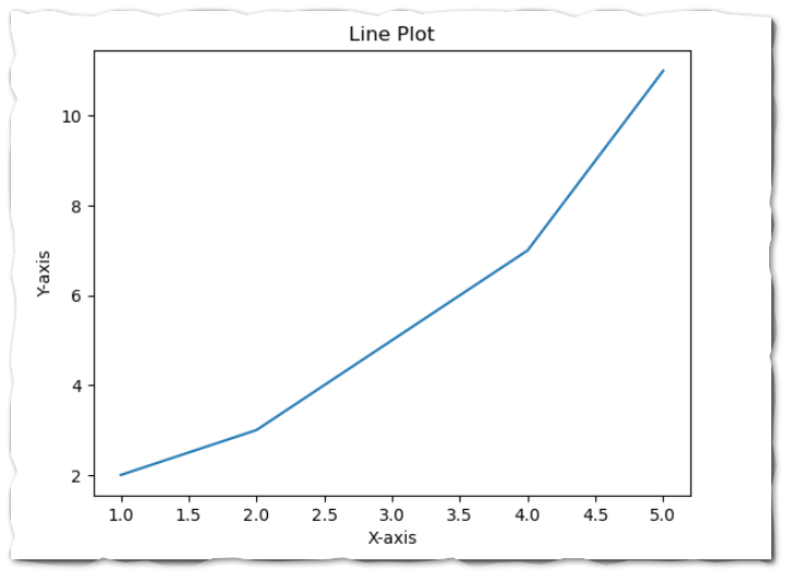
In this example, we use the plt.plot() function to create a line plot. We provide the x and y coordinates as arguments to the function, which generates a line plot connecting the data points. Additionally, we add labels to the x and y axes and a title to the plot using the plt.xlabel(), plt.ylabel(), and plt.title() functions, respectively.
Parameters of plot() function:
A variety of parameters are available in plt.plot() but these are some measure parameters that could be used to customize the line plot in Python Matplotlib.
Let’s see all the popular parameters of the plt.plot() function.
Linestyle:
This parameter indicates the style of the line that connects the data points.
There are various types of Lifestyle available in Lifestyle parameters.
- ‘-‘ or ‘solid’: Solid line (default)
- ‘–‘ or ‘dashed’: Dashed line
- ‘:’ or ‘dotted’: Dotted line
- ‘-.’ or ‘dashdot’: Dash-dot line
- ‘None’, ‘ ‘ or ”: No Line
Linewidth:
This parameter controls the thickness of the line. This should be any positive number default is 1.it could be 0.5, 1, 1.5, 2, 2.5, etc. (default is 1).
Color:
This parameter sets the color of the line.
- ‘b’ or ‘blue’
- ‘g’ or ‘green’
- ‘r’ or ‘red’
- ‘c’ or ‘cyan’
- ‘m’ or ‘magenta’
- ‘y’ or ‘yellow’
- ‘k’ or ‘black’
- ‘w’ or ‘white’
Markers:
This parameter indicates the marker’s style at each data point.
- ‘.’: Point marker
- ‘,’: Pixel marker
- ‘o’: Circle marker
- ‘v’: Triangle_down marker
- ‘^’: Triangle_up marker
- ‘<‘: Triangle_left marker ‘>’: Triangle_right marker
- ‘1’: Tri_down marker
- ‘2’: Tri_up marker
- ‘3’: Tri_left marker
- ‘4’: Tri_right marker
- ‘s’: Square marker
- ‘p’: Pentagon marker
- ‘P’: Plus (filled) marker
- ‘x’: X marker
- ‘X’: X (filled) marker
- ‘+’: Plus marker
- ‘D’: Diamond marker
- ‘d’: Thin diamond marker
- ‘H’: Hexagon2 marker
- ‘h’: Hexagon1 marker
- ‘|’: Vline marker
- ‘_’: Hline marker
Alpha:
It determines the determines the transparency level of the plot. The value of Alpha should be between 0.0 to 1.0.
Let’s customize the Line chart in Matplotlibe with the help of some parameters and functions.
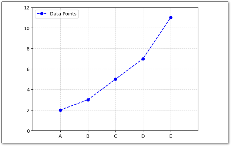
Adding Grid Lines
We can also add grid lines to our Plot to make it more readable. We can achieve this by using plt.grid() functions.
Let’s plot a line chart along with grid lines.
# Customizing the line plot
plt.plot(x, y, color='blue', linestyle='--', marker='o', label='Data Points')

# Adding legend
plt.legend()

# Customize axes limits
plt.xlim(0, 6)
plt.ylim(0, 12)

# Customize ticks and grid
plt.xticks([1, 2, 3, 4, 5], ['A', 'B', 'C', 'D', 'E'])
plt.yticks([0, 2, 4, 6, 8, 10, 12])
plt.grid(True, linestyle='--', alpha=0.5)

# Display the plot
plt.show()
The Output will be like this:
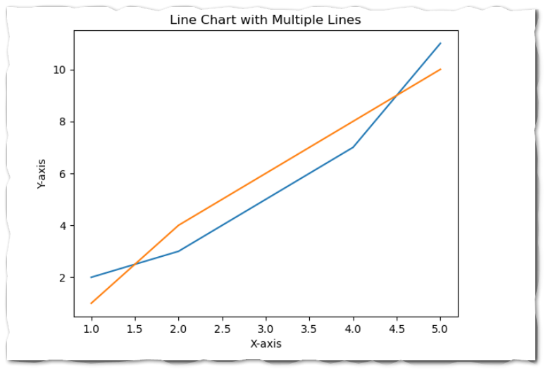
Matplotlib Line Chart with Multiple Lines
To plot a Matplotlib line chart with multiple lines, you can call the plot() function multiple times with different data for each line. Here’s an example demonstrating how to create a line chart with two lines.
import matplotlib.pyplot as plt

# Sample data
x = [1, 2, 3, 4, 5]
y1 = [2, 3, 5, 7, 11]
y2 = [1, 4, 6, 8, 10]

# Create a line chart with multiple lines
plt.plot(x, y1, label='Line 1')  # Plot the first line
plt.plot(x, y2, label='Line 2')  # Plot the second line

# Add labels and title
plt.xlabel('X-axis')
plt.ylabel('Y-axis')
plt.title('Line Chart with Multiple Lines')


# Display the plot
plt.show()
In this example, we have two sets of data (y1 and y2) corresponding to two lines. We call the plot() function twice, once for each line, providing the x-coordinates x and the corresponding y-coordinates for each line. We use the label parameter to specify a label for each line, which will be used in the legend. Finally, we call the legend() function to display the legend with the labels for each line.
You can customize the appearance of each line by adding parameters such as color, linestyle, linewidth, and marker to the plot() function call. Additionally, you can further customize the plot by adjusting the axes labels, title, and other properties as needed.
The Output of the above code will be like this.
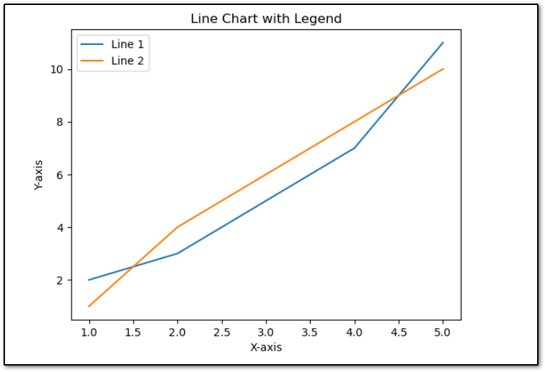
Adding Legend into MatplotLib Line Chart
In a line chart, a legend is a key that provides information about the lines or markers in the chart. To add a legend to a line chart in Matplotlib, you can use the legend() function after plotting the lines. The legend() function automatically creates a legend based on the labels provided in the plot() function calls.
Here’s a step-by-step guide on how to add a legend to a line chart.
- Plot the lines using the plot() function, specifying the x-coordinates and y-coordinates for each line. You can also provide a label for each line using the label parameter.
- After plotting all the lines, call the legend() function without any arguments. Matplotlib will automatically generate a legend based on the labels provided in the plot() function calls.
import matplotlib.pyplot as plt

# Sample data
x = [1, 2, 3, 4, 5]
y1 = [2, 3, 5, 7, 11]
y2 = [1, 4, 6, 8, 10]

# Plot the lines
plt.plot(x, y1, label='Line 1')  # Plot the first line
plt.plot(x, y2, label='Line 2')  # Plot the second line

# Add labels and title
plt.xlabel('X-axis')
plt.ylabel('Y-axis')
plt.title('Line Chart with Legend')

# Add legend
plt.legend()

# Display the plot
plt.show()
The Output of the above code will be like this.
Fill the Area Between Two Lines in the Line Chart
You can fill the area between two lines in a Matplotlib line chart by using the fill_between() function. This function allows you to specify the x-coordinates, y-coordinates, and the range between which you want to fill the area.
Here’s an example demonstrating how to fill the area between two lines in a line chart:
import matplotlib.pyplot as plt

# Sample data
x = [1, 2, 3, 4, 5]
y1 = [2, 3, 5, 7, 11]
y2 = [1, 4, 6, 8, 10]

# Plot the lines
plt.plot(x, y1, label='Line 1', color='blue')
plt.plot(x, y2, label='Line 2', color='orange')

# Fill the area between the lines
plt.fill_between(x, y1, y2, color='green', alpha=0.3)

# Add labels, title, and legend
plt.xlabel('X-axis')
plt.ylabel('Y-axis')
plt.title('Line Chart with Filled Area Between Two Lines')
plt.legend()

# Display the plot
plt.show()
The Output of the above code will be like this:
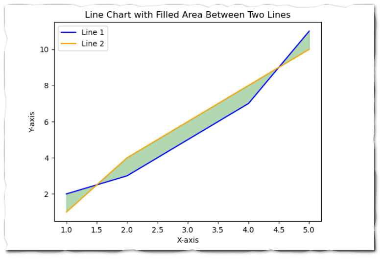
In the above example:
- We plot two lines using the plot() function, each representing different datasets.
- We use the fill_between() function to fill the area between the lines. We specify the x-coordinates (x), y-coordinates for the first line (y1), and y-coordinates for the second line (y2). Additionally, we specify the color (color) and transparency (alpha) of the filled area.
- Finally, we add labels to the axes, a title to the plot, and a legend to identify the lines.
This is how you can Create Line Plot with Matplotlib in Python.
Conclusion
So throughout this article, we have seen Creating and customizing line plots with Matplotlib in Python is a straightforward process that can yield insightful visualizations of trends and relationships in data.
By mastering line plots with Matplotlib, you can effectively communicate insights from your data and make informed decisions based on data analysis. In this article, we’ve covered the basics of creating and customizing line plots with Matplotlib, empowering you to create informative and visually appealing visualizations for your data analysis projects.
If you found this article helpful, please share and keep visiting for further Python Matplotlib tutorials.
Happy plotting!